How to Make Bold Wall Colors Work in Any Room
Want to make the move to bold color? The Better Homes and Gardens® Real Estate brand reveals tips for decorating with bold wall colors for vibrant, chic rooms.
This is the year of bold wall colors. While ivory and beige will always be popular, there is a growing movement for statement colors on walls, cabinets, and trim. Of course, bold color may feel different to different people, and it doesn’t mean you need to add only reds and oranges to your space. However, it does mean that deep blues are considered the new neutral, shades of green are everywhere, and, yes, statement reds are making their presence known. If you are curious about how you can make bold wall colors feel elegant and stylish in your home, read on as we explore this emerging trend.
Sleep Better With Bold Blues
Conventional wisdom suggested that bedroom wall colors should be muted, relying on beige or white hues to achieve a calming effect. A new study, reported on by Southern Living, throws that assumption for a loop. The Magazine writes: “According to Sleep Junkie, a website designed to deliver tips and data to support a better night’s sleep, beige in the bedroom might not be as soothing a hue as it’s painted out to be.” In fact, those who slept more soundly had bold wall colors in their bedrooms that were on the ROYGBIV scale, “with the most well-rested respondents sporting bedrooms in blue and purple.” Experts at Southern Living posited that even the most vivid blues evoked a sense of serenity. At the same time, purple “is often associated with wealth, wisdom, creativity, and magic, which can make for some dynamite end-of-day inspiration (and perhaps some pretty interesting dreams).”
Rethink An All-White Kitchen
All-white kitchens are perennial favorites. They are classic, elegant, and never feel dated. However, interior designers saw a marked increase over the last two years of dramatic colors, not just on the walls but also on the cabinets and surrounds. Hannah Yeo, Color Marketing and Development Manager at Benjamin Moore, told Martha Stewart Living that she expects to see shades of green dominating throughout upscale homes this year, as homeowners continue to want to connect their interiors to nature and find inspiration in a room that is seeing greater activity than ever. While some will adopt lighter sage green options, Yeo predicts darker shades, like Cushing Green, will also get attention.
Architect Bill Ingram agrees that a bold green color on walls and cabinetry can create a stunning and cohesive space. He explains to Southern Living that among his favorite colors is the bright and dramatic “Sherwin-Williams Evergreens (SW 6447),” which he added throughout a recent project, from the Thermador hood to the refrigerator surround, across the kitchen island and over the walls and doorways. When done well, it’s another example of bold color, presenting a polished and inviting atmosphere.
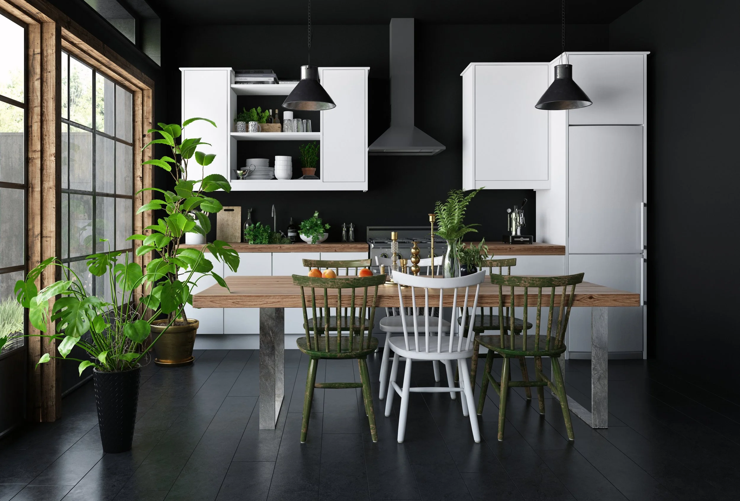
Of course, green is not the only color making its mark on elegant kitchens. Vivid deep blues, turquoise, and red (particularly when used for framing) can make your new kitchen sing. Even black and charcoal gray paints, which are increasing in popularity for home exteriors, are being brought inside this year. A black kitchen may be hard to picture, but take a tip from a recent chic renovation, heralded by Southern Living, which saw “owners EJ and Whit Brown [using] the same bold black paint (Sherwin-Williams Tricorn Black, SW 6258) on the exterior and interior, creating a cohesive mood throughout.”
Make Bold Wall Colors Your Living Room Backdrop
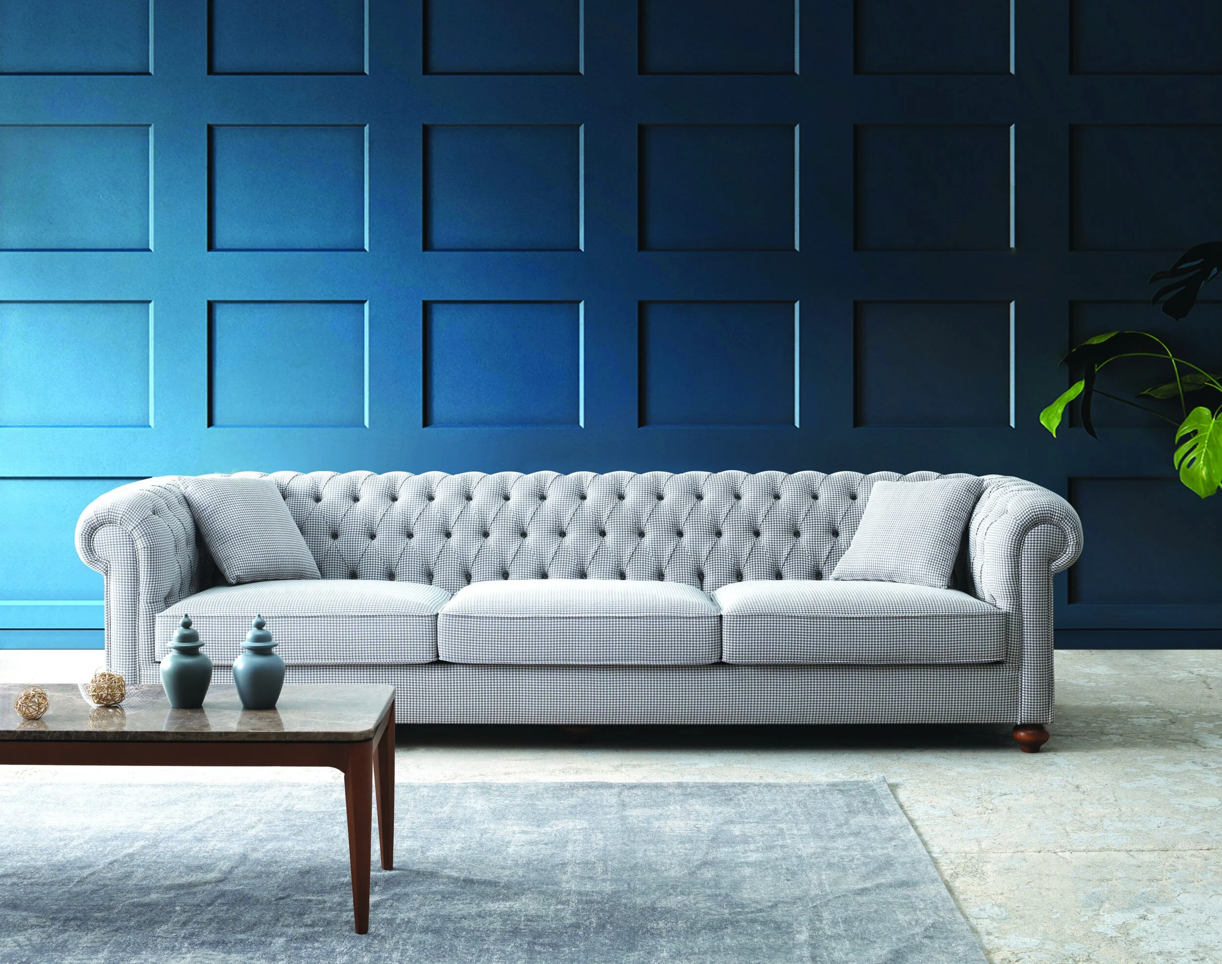
Design experts at Better Homes & Gardens are applauding the use of bold wall colors that act as a backdrop for other design choices. One of the Magazine’s favorite recent refreshes saw the coating of living room walls in a rich navy blue, which became an “almost … neutral backdrop that [could] pair with almost any other color.” In that design, red accents on the coffee table, end table, lampshade, throw, and more made the room pop. But you don’t have to stick to that blue/red palette. The Magazine suggests that you can “[try] the bold blue color with hot pink, pale blue, bright red, grass green—the sky is the limit.”
Better Homes & Gardens advises some caution when repainting a room, be it the living room, family room, kitchen, or office, to consider the amount of cabinetry and shelving. If those elements dominate the design, you may want to paint the trim in the same bold hue as the walls. Why? The Magazine explains: “By painting the trim the same color as the cabinets and walls, it recedes into the background to create a cohesive, sophisticated feel.” A sharply contrasting trim might feel too abrupt and distract from your intended design.
Create Stately, Cozy Offices
Does your home office or library need refining? We often focus on making our home workspaces practical rather than inviting. Even stately spaces can be elevated further with deep, bold wall colors and rich accents. Warm wine reds are among the most requested shades for library and office spaces. Interior designer Michelle Gage told Martha Stewart Living that she also believes that “‘we’ll see a rise in warm, juicy mulberry tones’” this year.
Home offices and libraries are often starved of natural light, either out of necessity or design, and we’re tempted to choose light colors on the walls to brighten the space. However, these spaces are supposed to help focus us and inspire. Cooler colors can make the room feel harsher and without dimension. This is another reasons to ditch light walls and embrace bold wall colors. Joa Studholme, Farrow & Ball’s top color expert, told Martha Stewart Living: “‘When you are starved of light, it’s better to go for a really strong color to add depth to the room’” and create a more welcoming environment.
Create a Richly-Hued Bathroom
From historic estates to modern minimalist homes, guest bathrooms are being upgraded from utilitarian to statement spaces. Here, the deep reds also shine. Whether you choose paint or patterned or textured wallpaper, crimson walls are in demand. Interestingly, so is the seemingly opposite approach. Better Homes & Gardens reports: “Dark, moody colors continue to be popular with consumers and color forecasters. Experts believe this trend will continue in the year ahead—and get even darker, with rich, almost-black charcoals.” Whether you choose the darkest shade of gray or the richest red or somewhere in between, bold wall colors can transform a guest bathroom from an unremarkable room to a truly luxurious space.
Visit Distinctive Collection by Better Homes and Gardens® Real Estate when you begin your journey to buy or sell your unique home.
Article Resource: Better Homes and Gardens Real Estate, Distinctive Collection Blog, 04.11.22|Categories: INTERIOR DESIGN


